Monday, June 30, 2008

A Weekend of Good Movies


So last semester I missed out on a lot of movies, I think, because I had no one or group set to go with. I remember back in middle school Travis, Ricky, Kevin, and I would always go to the movies like every Friday each week. We would watch just about anything that would come out and sometimes even watched two movies on the same day. Whether it was because our minds were at that awkward stage where we are in between being immature and mature or because at that age we had nothing better to do on our Fridays, we would always go. As high school came along, we went less frequently but still continued to watch movies together or at least had other friends to continue the trend.

Last semester, I went and saw two movies while I was here in Berkeley. Both times I went with my high school friend, who also goes to school here. Maybe I did not miss out on too many great movies and saved myself some money in the process as well, but I miss just going to the movies and catching whatever catches my interest. I miss the biggest concern being when the movie is rather than who I need to go with. This weekend was a bit of a nice change and just reminded me of how watching movies is back at home. I still went with one of my high school friends, but it felt nice seeing so many films in this area even though the circumstances were simliar to back at home.

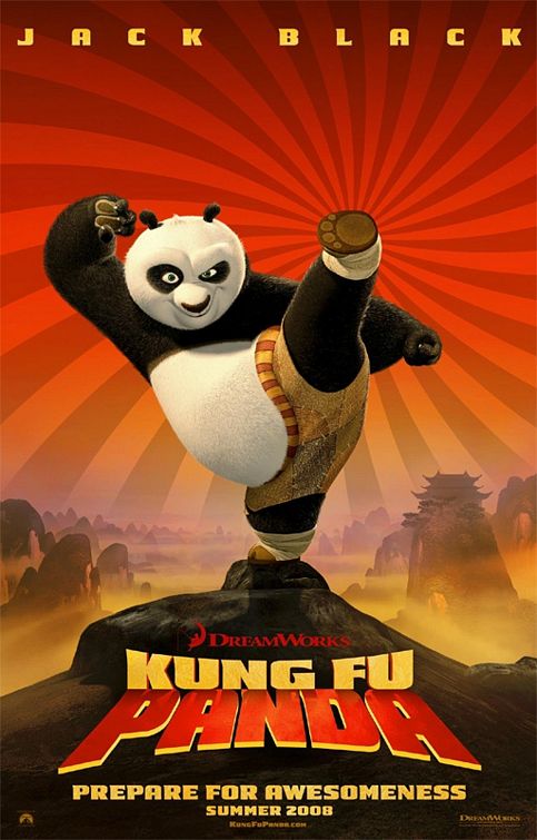
Anyways, the real point of this post (which I did not intend to be so long) is that I saw three amazing movies this weekend. Three! That is more than I saw in a whole semester here. I recommend you all go see them! Kung Fu Panda was hilarious, Walle was fun and cute, and Wanted was packed with action. I think of the three, which were all really great movies, Wanted took the cake this weekend just because I was so impressed by the special effects and action sequences that were more unique than most the typical action movies that I have seen lately.

So go and see them now if you haven't!

Wednesday, June 25, 2008

The Artist

Yesterday, my art instructor really hit a chord. I usually zone in and out of her random rambles, but she made a point really clear and obvious that I never realized. She said that being an artist is a loner activity or career. I had no idea what she meant at first but as she went on it all made sense. The artist isolates himself, comes up with ideas alone, and creates a work all alone. The artist does present this work to others but only the artist understands the work in its entirety. No one else knows all the meanings behind it, the inspirations and thoughts that went into it, the exact procedures it took to produce it, and all the flaws or details that artist may or may not have intended to put in it. Being an artist, in a sense, is self-gratifying because you do not have to satisfy anyone but yourself and your own inspirations and intent.

This all may sound really obvious to some of you, but I never realized this at all. I think what hit the chord the hardest for me was the parallel between the artist and the loner. I have always considered myself an outsider or loner I guess. It is not that I don't have friends or anything like that, but I always feel and felt that there is some kind of distance between me and even the closest people I know. I guess hearing that connection from my art teacher was just something to make some sense of my own identity.

Tuesday, June 24, 2008

Suh-Weet Floor


So I saw a pretty amazing video in my art studio today. It is a PBS series called Art:21 which follows many contemporary artists in the United States. I really like it because it not only allows you to see many different artists and their work, but it allows the viewer to really see the artist at work and have a more intimate and personal view of the artist. I think most of the artists I got to see today were pretty amazing, but one in particular was Do-Ho Suh. I found his story so inspiring and his identification and representation of the Korean culture so intriguing.

A Brief Biography: Do-Ho Suh was born in Seoul, Korea in 1962. After earning his Bachelor of Fine Arts and Master of Fine Arts in Oriental Painting from Seoul National University, and fulfilling his term of mandatory service in the South Korean military, Suh relocated to the United States to continue his studies at the Rhode Island School of Design and Yale University. He is best known for his intricate sculptures that defy conventional notions of scale and site-specificity, Suh’s work draws attention to the ways viewers occupy and inhabit public space.

The picture above shows his work called "Floor." It is composed of a variety of tiny figures of men and women. Each figure is different and holding up the large glass surface of the floor. Just seeing this work on the video left me breathless. He uses this technique in a couple of his other works as well, and I think it is absolutely genius.

Definitely an artist to look into. More info and other artwork here

Wednesday, June 18, 2008

O Tablet, Where Art Thou?

I want this one

But will probably have to settle for this one

As I mentioned before, I was really inspired by Madison and her graphic art piece she did with her Wacom tablet and Photoshop. I really want to learn how to use one and be able to do the same quality of work. So now I am on the hunt for a tablet! Unfortunately, like all art related supplies, tablets are not cheap. The regular tablets that are decently sized run about $400-500 (like the Wacom Intuos3 9x12). However, the real beauty and Holy Grail of all tablets is Cintiq series by Wacom that allows you to directly draw on the screen rather than a traditional tablet where you have to view your movements and strokes by staring at your computer screen. Too bad the Cintiq series is around $2000 ($1000 if you want the small one). For now, I will be looking for a good deal on a regular Intuos3 and perhaps upgrade to a Cintiq in the future. A normal tablet should be enough for dipping my feet in the unexplored waters of creating graphic art. Hopefully I can find one soon!

Also, congrats to the Celtics for owning the Lakers and winning the NBA championship tonight. Garnet, Alan, Pierce, Rondo, and Powe, you all deserved it. Great job on the 17th Championship on the 17th of June.

Tuesday, June 17, 2008

Inspiration


I feel like inspiration for my artwork is forced most of the time. Whether it be because of deadlines for my projects or not, I can't really say. However, I never really had that overpowering nourishment or drive to feed the emptiness within my head to produce truly satisfactory work. Much of the time I feel like I can do so much more with my art, but it never seems to translate as well as I it want to. I think I start an idea and finish it simply because I want it finished rather than the inspiration calling forth for its completion. Perhaps I need to keep feeding the hunger to produce art by finding the beauty and genius in the things and experiences I encounter in order to continue to find inspiration. 

I guess this past week was a wake up call to open my eyes in what artist and even myself are capable of. I am taking a drawing studio right now for summer session, and we had our first project critiques. Let me just say, I was blown away by the content and skill by many of the artists in my class, which I wrongly assumed were not well versed in their art craftsmanship. In particular, a girl named Madison created one of the most beautiful graphic artwork pieces using a Wacom Tablet and Photoshop that I have ever seen. It was a self portrait that possessed many different memories she had all molded into one single piece with her calmly sitting in a bathtub looking out into the orange sunset that contrasted so well with her beautifully drawn purple tree that some of her cats playfully surrounded. This work looked like something out of a professional portfolio. I was am so jealous of her skill and I am determined to learn. 

Today, my art class took a field trip to the Museum of Modern Art in San Francisco. It was my first time there, and I was impressed. The Frida Kahlo exhibit was open, but I did not bother to see it because I didn't want to spend the extra money and didn't have the time anyway (the lines was long anyway). Regardless, I saw some amazing works that really made me reflect upon my inspiration for my artwork. Two works in particular were René Magritte's "Les Valeurs Personnelles" ("Personal Values", pictured above) and James Rosenquist's "Leaky Ride for Dr. Leakey."

Magritte is a personal favorite of mine, and his work has undoubtedly been an influence on my own work ever since I first laid eyes on "The False Mirror." Just seeing his work today and the skill he possessed in both producing the work and arranging it made me really reevaluate my own artwork and want to strive for that same kind of quality and translation of my ideas.

Until today I had never heard of Rosenquist but seeing his massive piece that dominated the entire left wall of the exhibit reminded me to strive for the same ambition, which I seem to lack quite often, that drove him to complete such a large work and find new ways to combine even the simplest arrangement of ordinary objects and patterns together.

Overall, I think I have found some inspiration to feed off of for now. I guess it can be a gateway for more to come. I just have to remember I am working for the art and not the due date of it.

Monday, June 9, 2008

Decisions

So I am sure all of you have heard or will hear soon enough about the 3G iPhone. You can't avoid it on the internet right now, and you probably won't be able to anywhere else. 

Now here comes the hard part: Which phone to get next?

or


Do I leave Windows Mobile and the keyboard I have grown so fond of over the last couple generations of HTC products I have owned for the convenience of syncing directly with my Mac, without having to go through bootcamp, and having the built in storage for music and the continuous development and support put out by Apple.

Or do I just upgrade to the next generation of my current phone and stick to the familiarity.

If I do go for the iPhone, I would almost be downgrading (overall spec-wise) from my Tilt besides the fact that it has built in memory.

Hmmm decisions indeed... 

Sunday, June 8, 2008

Two Words


Life is such a complex yet fragile mass of situations, people, and emotions. Reflecting back on everything that has happened and my current state, I am truly thankful and truly blessed for everyone and everything that I have or have come across. I know I take many of these things for granted most of the time, but I want to state this again, as meaningless and as worthless as these two words are: Thank You.

Tuesday, June 3, 2008

First Apartment

So I finally got the keys to the apartment today.

Courtney (roommate/high school friend) couldn't come today but will be coming this weekend with his stuff to move in. I am moving all my stuff in over the weekend too. So by the end of the weekend it should look transformed. 

But here are pictures of the place empty:


Initial Thoughts: The place is pretty spacious. It is decently clean but certain aspects of the apartment are old. For example there are mainly 2 prong outlets throughout the house, which I find a bit annoying, but adapters can fix that. They threw in a fridge and there was even a roll of toilet paper in the bathroom. There is a light in one room but not the other, which I find useless. The screens aren't completely sealed shut, which hopefully does not mean more bugs or freezing/hot temperatures. However, in the end, all these minor details can be fixed and worked around. Overall, I am pretty pleased with the place. Hopefully some house warming parties will be rolling into full effect soon.

Sunday, June 1, 2008

The Name

COLOR CRISIS

So with every great name there is a great story right?

Well I can't say this story is great, but it is a story nonetheless. 

It all started at the Kanye West show (An amazing show by the way). The main t-shirt that everyone was getting for the Glow In The Dark Tour came in a bright blue or a bright red. I was stuck. They both looked so clean. I could see myself rocking either one. I have so many blue shirts and my wardrobe is lacking in any red except a couple hoodies. However, I of course ended up getting the blue one. Justin said it was “so you” and I knew it too. But I think the hesitation goes back to my former love affair with the color Red.

As a kid Red was my favorite color by far. Why? I really don’t know. I hate blood and cringe at the sight of it but for some reason red was my favorite. I think it might have been because red was so eye catching. But as the years progressed, blue started to grow on me. In particular, the eye catching effect of light blue and any bright variation of blue in general. Even navy blue is enticing. I want to say the feminine association of the color red drew me away from it, but I really don’t know.

Anyway, it was this clash of colors that prompted the name. As I thought thinking of a new identity to claim, I asked a few others if they had any ideas. What better way to identify yourself than by those closest to you right? Well, Justin brought back this topic of red vs blue. He first suggested some paradoxical names like “Redder Blue” or “Bluer Red.” They sounded okay but a little too cliché. Then he suggested “color crisis.”

It sounded so SIMPLE right? But for some reason, I couldn’t let go of it. I spent the next day with the name on my mind seeing if it would stick. And the more I thought about the name the more it grew on me.

The deal break was this realization: COLOR is composed of 5 letters. There are 3 primary colors and 3 secondary colors. However, if you place blue to represent one end of the word (C) and red one the other end (R), you don’t necessarily need one secondary color. So having each color represent an individual letter you have a placement of primary, secondary, primary, secondary, and primary. The beauty of this is that the secondary colors represented in the (O)’s are produced by their adjacent primary colors. So the order would be C (blue), O (green), L (yellow), O (orange), R (red).

Even if you spell color the English way “colour” which makes it 6 letters you could simply shift all the letters over and make (R) purple. This way all the 3 secondary colors are represented.

What about CRISIS? Well CRISIS can be used in many different ways. Maybe make it purple since that seems to be the only color missing when spelling COLOR. Or maybe make it neutral to the situation and emphasize the colors in COLOR by making CRISIS either a white, black, or maybe gray. CRISIS could even have its own color scheme by creating a symmetrical balance with COLOR. The (C) of CRISIS could be purple and the rest of the colors in COLOR could be repeated in the opposite order so that the red in the (R) of COLOR would also be the (R) of CRISIS and the orange in the (O) of COLOR would also be the (I) in CRISIS, and etc until the blue would finally complete the (S).

This is why I can’t let go of the name.

I think, therefore I am.